 Admin CliCours
Vers l’infini et au-delà
Les mobiles, à la conquête du monde ?
Sur écrans de bureau :
moteurs de rendu hétéroclites
(Internet Explorer (50%), webkit, gecko)
tenir compte des retardataires
Sur mobiles :
moteurs de rendu très aux normes
(Webkit (50%), presto, gecko)
un potentiel extraordinaire
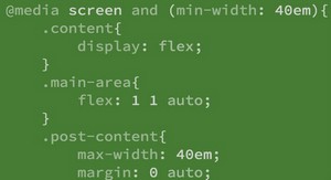
Positionnement avancé
(inline-block, table-layout)
CSS 2.1 avancé
(:before, :after, sélecteurs, first-child)
CSS 3
(border-radius, box-shadow, @font-face,
flexible model, transparence,
transformations, animations, media-query)
HTML 5
(formulaires, géolocalisation, etc.)
 Si le lien ne fonctionne pas correctement, veuillez nous contacter (mentionner le lien dans votre message)
CSS adapter un design sur mobile (5,30 MO) (Cours PDF)